In this tutorial, I will show you how to create a very simple & minimal Ghost Button with CSS. Ghost Buttons are quite popular these days and are trending design element while doing minimal & Flat Web design.
While there are multiple ways one can approach making the Ghost button, however, I will keep it super simple and use just CSS to style our ghost button. We will also add simple hover effects to make our Ghost button give visual feedback to user when pressed.
Ghost button CSS
We will be writing a “ghost-button
” CSS class (shown below) which when applied, will convert any <a href=”..”> tag to a ghost button.
.ghost-button {
  color: #009688;
  background: #fff;
  border: 1px solid #009688;
  font-size: 17px;
  padding: 7px 12px;
  font-weight: normal;
  margin: 6px 0;
  margin-right: 12px;
  display: inline-block;
  text-decoration: none;
  font-family: 'Open Sans', sans-serif;
  min-width: 120px;
}
The trick here is to remove the default text-decoration of links, add thin borders and define some padding to make it look like a rectangular button. On hover, we can simply fill the button with color to give visual feedback to the user.
.ghost-button:hover, .ghost-button:active {
  color:#fff;
  background:#009688;
}
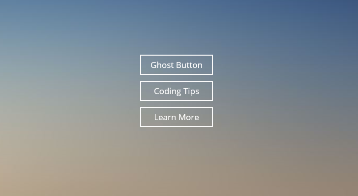
You can see the result in codepen embed below and see the corresponding CSS and HTML files too.
See the Pen Ghost Button CSS #1 by Kanishk Kunal on CodePen.0
If you are using RSS feed reader, or by any chance the embed above doesn’t appear then please visit the Pen live on CodePen
I hope that you found this CSS code snippet to make Ghost Button useful. Let me know if you have any comments or have any variations of Ghost button in mind that can be implemented with plain CSS.
We also have the advance demo where we try to create Ghost Buttons on background image.